Warning: Missing argument 2 for wp_widget() in /home/habza/www/7/wp-includes/widgets.php on line 76
Habza.pl - my perception of the marketing world - Part 6

FreeCreditReport.com: a naughty puppy becomes a nice credit score, does it keep up to the pirates legend?


Freecreditreport.com
Załadowane przez: Habzapl

New advert of the FreeCreditReport.com, a service which provides ‘real time’ information to its users about their credit reports/history. When you’re unable to do the math alone, with such information you should be able to manage your finances in a wiser way, do some planning, and stuff like that. If you’d ask me, a person with basic financial literacy level would be able to do most of that stuff by himself, but the topic of financial literacy, and role of the financial institutions in improving it is deep enough for some separate entries. I see here a large area to use, as in many markets (name Poland…) subject is almost untouched. Hopefully one day I’ll be able to implement some solutions related to it.
Returning to the spot. I’m not sure if you’re familiar with almost-the-best-spot-ever-made. Why almost? Well, it has pirates (SINGING!) in it, and the only thing which’s lacking here are the NINJAS. With them it could’ve been the best ever made ;-). If you don’t know what the hell I’m speaking about, please update your cultural references. A good soul’s putted all six singing spots of the FreeCreditReport.com on YouTube. Listen yourself.

Brilliant, isn’t it? It is always hard to be a successor of a successful campaign. The ‘doggy’ one does not even come close to its predecessor, but I believe it has a different role. When the sung commercials promote your brand, increase awareness, and basically tell what your business does, so it becomes familiar to the general public, it is impossible to present in them the ‘hard numbers’. So, with that in mind, and if we’ll treat it as a different category ad, it isn’t so bad. They’ve failed in creation of a likeable ‘fluffy’ puppy from the improved score numbers, but at least they’ve animated some life into it, and people do love it (for a perfect spot, the boy should have more time). Concept is ok, with the help of FCR the lady was able to control the spoiled puppy/credit report, and they’ve lived happily ever after. What lacks here is a clear image how the FCR and its website helped the lady. Maybe one-two shots with a laptop, or a manual how to deal with misbehaving puppies? Generally, ok.

Inspiration: COLORIBUS

The Date


The Date
Uploaded by Habzapl

Entry in English
Czternasty odcinek sezonu szóstego: “Three Valentines”. Niles przygotowuje się do walentynkowej randki obracając ją w piękną katastrofę Podobne przygody mają Frasier i Martin. Opis odcinka (eng).
Wszystkie odcinki do kupienia tutaj.


Fourteenth episode of the sixth season: “Three Valentines”. Niles is preparing himself for a Valentine’s Date, turning it into a beautiful catastrophe.
Here you can find episode summary, and here all episodes of this great sitcom can be bought.

Timberland: Mockage of the financial institutions by a shoe company, nicely done

Crisis and problems of the financial institutions are a great source of themes for promotional usage. You can literally mock them with impunity, and that’s basically what Timberland a well known manufacturer of the outdoor wears does. With some interesting catch phrases too:

‘We build things to last, maybe we should start a bank’, implied nowadays banks are not durable/reliable

‘One American institution that won’t fall apart’, implied all other major financial institutions failed

‘You’re never going to be able to retire, why should your boots?’, implied due to the crisis, or the fact that your savings evaporated, you should own some good boots…

‘How revolutionary, a jacket that can keep two people dry‘, implied saving, but the true meaning is the discount, and charity action. When you’ll return an old Timberland jacket while buying new, you’ll get 20% discount, as well as your jacket will be donated.

Advertising by negative comparison is cruel, but effective. Situation around us creates opportunities never considered earlier. Boots and banks in one advert? C’mon, this can not work. Very nice job.

Inspiration: Ads of the World

MasterCard: Valentine, things we do for love are indeed priceless


MasterCard: Valentine
Załadowane przez: Habzapl

Main benefit of such actions, excepting the happy couple is free media attention. I’m sure that a guy hanged into a billboard for some time didn’t came unnoticed. I remember articles, when some guy just bought few billboards in Warsaw, also in the Valentine Day on his love daily route to work, and wrote his feelings to here there. MasterCard action was supported by a website.  Generally speaking it is a great idea, and well thought, like the violin players focusing attention of the passersby, who stops, and look on that poor dude. MasterCard logo is hardly imposing, always a temptation (hey, we’re paying for that, so lets put our giant logo there, right?). Thanks to that, message is not interrupted, and it is truly beautiful message: ‘The things we do for love: Priceless’. By that a brand ‘personalization’/humanization is achieved, it is no longer an inhuman institution, but a friend, who can help you, exactly you. No to some poor African kids by an affinity card, but YOU.

Inspiration: I believe in advertising

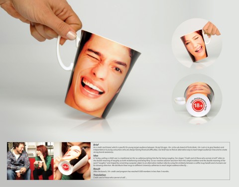
Fortis Bank Turkey: 18+ mug, ear pulling

Fortis Bank Turkey mug, ear pulling

So, the brief states, that pulling child’s ear is a traditional form of punishment, or rather correcting someone’s behavior in Turkey. Fortis combined this action with a slogan ‘Credit of those who cannot sit still’, and the general message was that they are targeting into the young, active and unregenerate. Mugs were donated to the local university cafeterias so the effect could’ve been multiplied.
I didn’t got it first time I saw it, but with a second look it gets to you. Maybe I was confused, because there was nowhere to find the Fortis logo, or name of promoted product? I’m assuming, that boy/girl face is displayed on the both sides of the mug, leaving the only place for commercial communication at the bottom of the mug, where the big red logo +18 is placed (maybe it is used by Fortis for communication, don’t know, but I guess that the Turkish inscription around it is the ‘who cannot sit still’ slogan). If it so, it is not the optimal solution. How people will know what exactly the mug is promoting? Did Fortis marketers thought that students will ask each other, hey what does your mug mean? Hardly.
With a third look, it seems, that face is placed only in front of the mug. So the second side is just a giant blank white unused space, or maybe Fortis ID message is there? Without these information it is hard to evaluate. Idea is not bad, especially as it is attached to the local customs (maybe the ear should’ve been larger/more massive). I’d improve it by placing the face under an angle, so it would have come into the horizontal position, when drank, This could attract even more attention.

Inspiration: Ads of the World