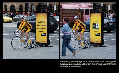
 An ambient project from Australia, created by the SBS TV station, which had been covering Tour de France race at the time. Idea is simple – put one guy in a shiny yellow suit on the street, and order him to pedal for 21 days (fortunately not 24h, but from 8 am to 4 pm, and with two days of break-off as in the original race…). But the poor biker is not going anywhere, as his pedaling is powering the scroll of the metrolite/citylight stand. Event was projected as an endurance test (but it is a bit hard for me to see a clear connection between a TV station and endurance…)
Pros
If the duration period and dates were chosen as of the original race (we do not have enough information) – ok
Even the ads are an endurance event – very good slogan if we believe in the link between TV station and endurance. I might have had placed it in the Cons section, as I believe that every marketing action should not only focus on the promotion of specified product/event, but also brand which stands behind it. Here I do not see it. Also yellow, a good color for pointing above crowd, in this case is AFAIK not associated with the company colors.
Cons
Stand design is nothing unusual – just an ordinary metrolite with a bike attached. If it was planned to distinguish itself from the metro jungle, it would be better if it would had been designed larger, maybe with let’s say few LCD’s with transmission (due to the time zones difference, it would be probably a retransmission) of the race.
Only one location (again, the info…)? We do not know that, but if the biker was located all the time in one place, even if that was Melbourne’s Times Square is an obvious waste of resources. Bike is a definition of mobility, so every day (all even few times during that same day) it should be moved through a set of different popular locations.
Pointless effort – why the bystander should not ask himself – what a waste of resources/time, as there is no added value to this project. It creates and leaves nothing.
Possible improvement
Socialize it, involve the people. Why not combine that single guy efforts with a charity event (always a relatively cheap way to gain publicity). Let’s say that on the final day of the race SBS makes an event on a local stadium, and pledges to do something (probably give money of theirs or sponsors) for a selected charity. They would invite people with their own bikes on the stadium ,give them distance meters, and tell that they (or sponsors) will donate a sum for every kilometer they will ride that final day on the stadium. There would be a possibility to make a larger health-related event of that.
Put a kilometer meter, or some bar/scale which would present achieved distance.
Implementation in Poland
Not likely, not only because of the weather conditions, but also because of the niche the cycling sport is. It _could_ be used together with a sort of a social/health campaign, or promoting biking as a way to spend time.
Evaluation: 4/6
Tagi: Ambient, In ENGLISH, Marketing, Oldies. Autor: Jan Habza
Komentarze (0) »
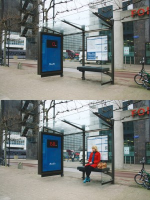
 Earlier I’ve showed how a citylight should be used to focus attention (snow). This time, an example of a bad strategy. An electronic scale is linked with the bus stop weight, and is showing the sitting person weight. Definitely is also focusing attention, but not in a way people like. I believe this bench will stay empty for a long time. Often you have to show your Clients that they do have a problem, but doing so in a rude, but honest way may backfire you. You don’t want to make them angry, you want them spending money in your establishment.
