Ambient- archiwa tagu

Esquire: Augmented reality puts the new spirit into old media


Esquire magazine uses an innovative approach to revive, make sexy again the media doomed by many – a paper magazine. Naturally, this is a specific situation, as Esquire target will not migrate completely to the Internet – not like in the case of traditional newspapers. Nevertheless they are paying effort to create some media buzz, so people will start talking again about something as familiar as a magazine. Video does explain most of the things, I also recommend checking Behind the Scenes of Augmented Esquire.  AR is basically live direct or indirect view of a physical real-world environment whose elements are merged with (or augmented by) virtual computer-generated imagery – creating a mixed reality.  So, by showing certain image to our camera, we are gaining access to some content. Here is an example how an image from a pizza box unlocked part of a website:

How does it work here? After installing the software, assuming we have a webcam, it is enough to launch the application and place the magazine cover in front of a camera. Software should recognize the code, in this case located below Robert Downey Jr., and the fun can begin. Interactive elements are located in the whole magazine (I wonder where is the legend to that, so the user will not miss a single thing), often celebrities are used in these interactions.  Definitely funny and new for the potential client. Surely, this is a one-to-few times action. Not only because of the work preparation of such feature consume, but also if it would have become a standard part of the magazine, people would simply got used to it.

I do see some potential downsides, like how sophisticated that recognition is – will it work in case of the low-end webcams? Sign (code) is rather big, but still, who knows. If it will not work,  some users may get annoyed.  It is a step in the right direction, user has to be engaged, take part in something new and exciting. This also does harmonize with the upcoming Microsoft Natal, also a camera-movement recognition solution, where player will control video games using whole body as a controller. So, there is a future in such ideas.

Inspiration: Adverblog

MasterCard: Valentine, things we do for love are indeed priceless


MasterCard: Valentine
Załadowane przez: Habzapl

Main benefit of such actions, excepting the happy couple is free media attention. I’m sure that a guy hanged into a billboard for some time didn’t came unnoticed. I remember articles, when some guy just bought few billboards in Warsaw, also in the Valentine Day on his love daily route to work, and wrote his feelings to here there. MasterCard action was supported by a website.  Generally speaking it is a great idea, and well thought, like the violin players focusing attention of the passersby, who stops, and look on that poor dude. MasterCard logo is hardly imposing, always a temptation (hey, we’re paying for that, so lets put our giant logo there, right?). Thanks to that, message is not interrupted, and it is truly beautiful message: ‘The things we do for love: Priceless’. By that a brand ‘personalization’/humanization is achieved, it is no longer an inhuman institution, but a friend, who can help you, exactly you. No to some poor African kids by an affinity card, but YOU.

Inspiration: I believe in advertising

Fortis Bank Turkey: 18+ mug, ear pulling

Fortis Bank Turkey mug, ear pulling

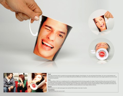
So, the brief states, that pulling child’s ear is a traditional form of punishment, or rather correcting someone’s behavior in Turkey. Fortis combined this action with a slogan ‘Credit of those who cannot sit still’, and the general message was that they are targeting into the young, active and unregenerate. Mugs were donated to the local university cafeterias so the effect could’ve been multiplied.
I didn’t got it first time I saw it, but with a second look it gets to you. Maybe I was confused, because there was nowhere to find the Fortis logo, or name of promoted product? I’m assuming, that boy/girl face is displayed on the both sides of the mug, leaving the only place for commercial communication at the bottom of the mug, where the big red logo +18 is placed (maybe it is used by Fortis for communication, don’t know, but I guess that the Turkish inscription around it is the ‘who cannot sit still’ slogan). If it so, it is not the optimal solution. How people will know what exactly the mug is promoting? Did Fortis marketers thought that students will ask each other, hey what does your mug mean? Hardly.
With a third look, it seems, that face is placed only in front of the mug. So the second side is just a giant blank white unused space, or maybe Fortis ID message is there? Without these information it is hard to evaluate. Idea is not bad, especially as it is attached to the local customs (maybe the ear should’ve been larger/more massive). I’d improve it by placing the face under an angle, so it would have come into the horizontal position, when drank, This could attract even more attention.

Inspiration: Ads of the World

Child labour: Burden, one person can make a difference

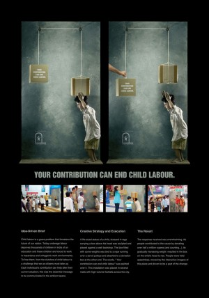
Outdoor ambient projects are a nice way to focus massive public attention on especially hard issues. It can be used by social organizations, as well as by commercial (by sponsoring the socials…). In this case, from India, a problem of children exploitation was used – as a work force. So they’ve put a realistic statue of a kid carrying a pack, a mechanism allowing the passerby’s to relief him, all encouraged with this message: ‘Your contribution can end child labour’. The best part of this idea is the fact, that it shows that individual actions have sense. Exploit kids are not just an unnamed mass with some issue. It’s happening here and now, you can SEE and TOUCH the problem, also your action has an immediate positive effect. Well done.

Inspiration: I believe in advertising

Fitness First: Bus stop, you don’t want to be honest with your Clients

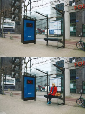
FitnessFirst bus stop citylight scaleEarlier I’ve showed how a citylight should be used to focus attention (snow). This time, an example of a bad strategy. An electronic scale is linked with the bus stop weight, and is showing the sitting person weight. Definitely is also focusing attention, but not in a way people like. I believe this bench will stay empty for a long time. Often you have to show your Clients that they do have a problem, but doing so in a rude, but honest way may backfire you. You don’t want to make them angry, you want them spending money in your establishment.

Inspiration: I believe in advertising